FULL SERVICE — NAMING, BRAND, PACKAGING, ART DIRECTION
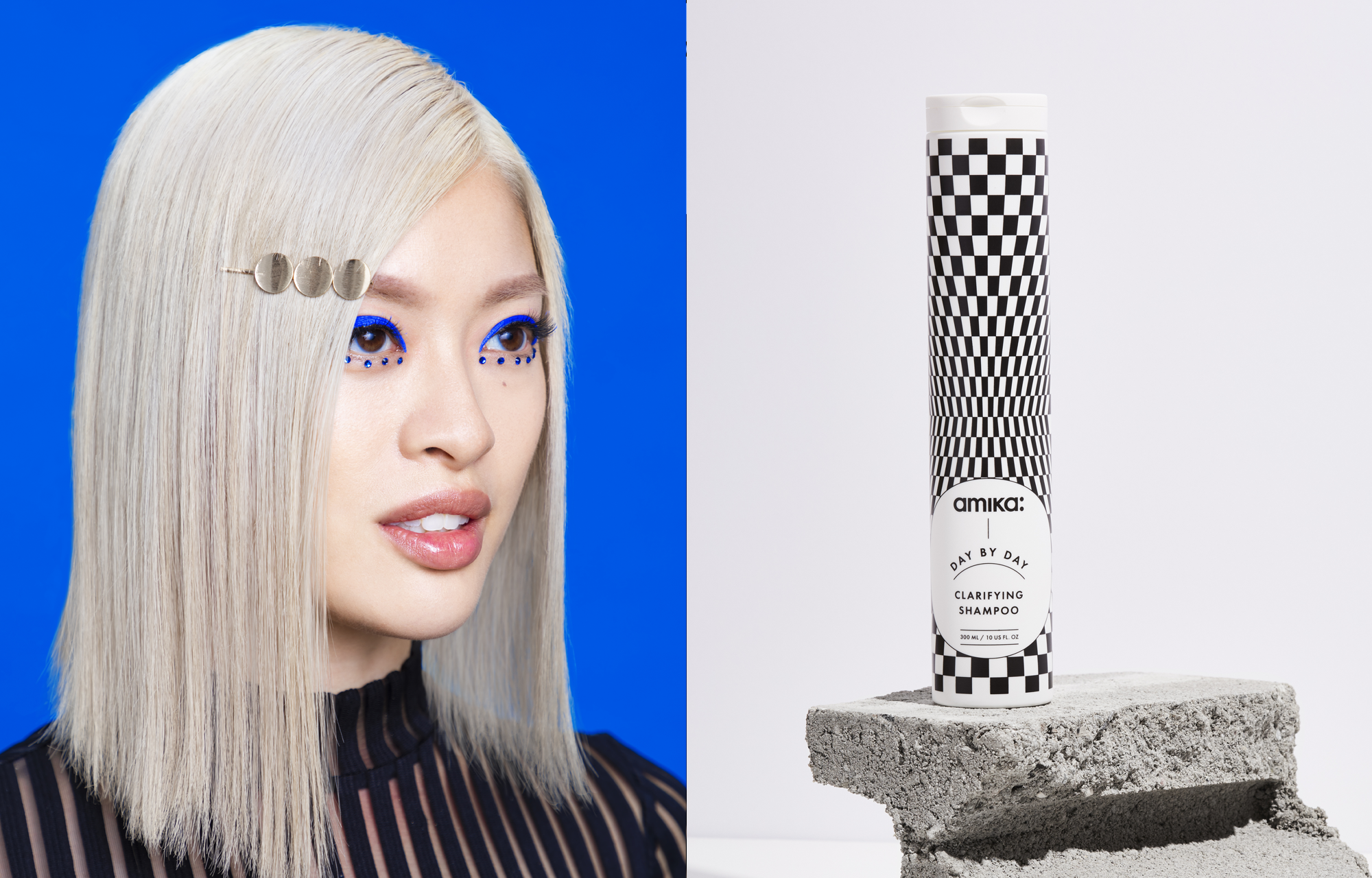
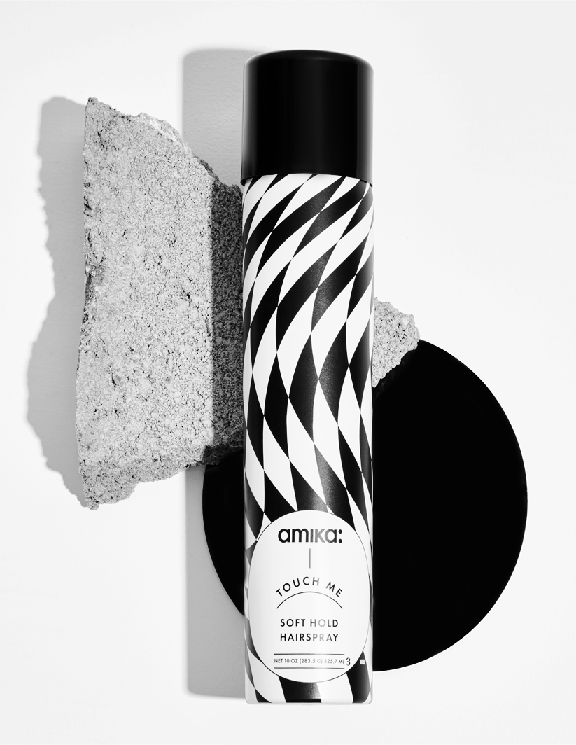
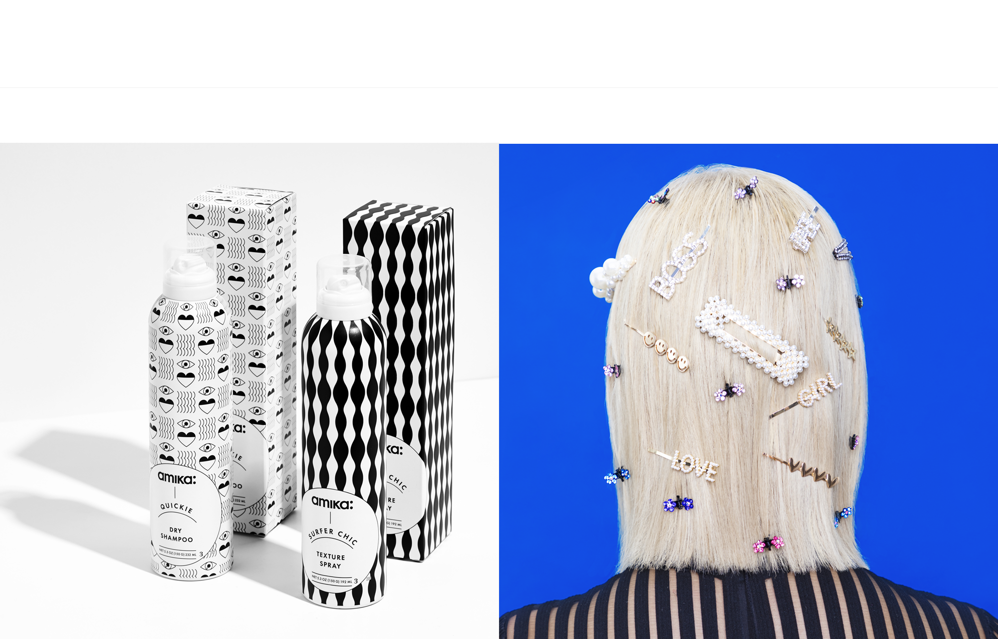
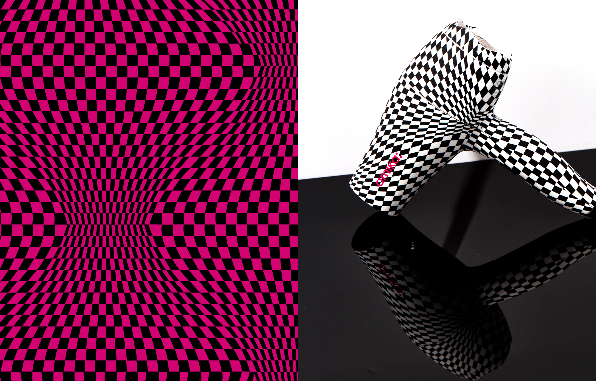
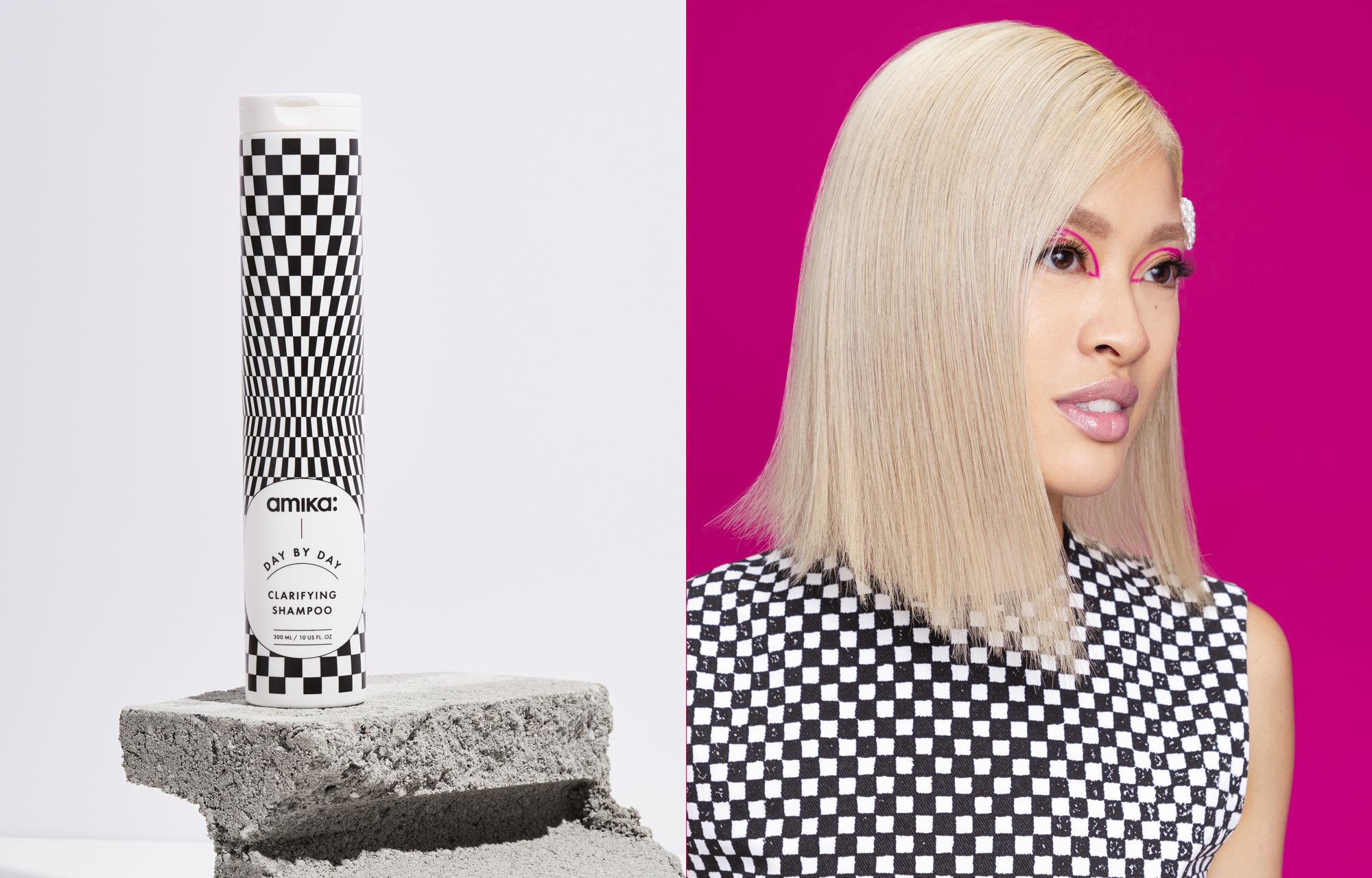
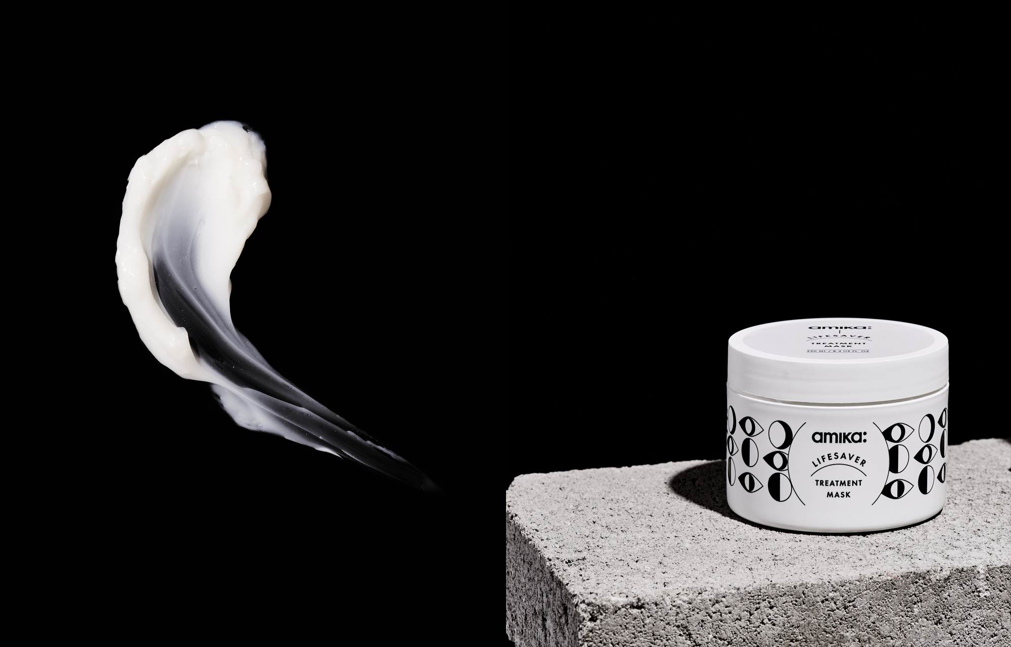
amika’s premium icon line made especially for the hong kong market, is a luxury, clean beauty haircare, inspired by the simplest of patterns, the humble checkerboard bathroom tile. a packaging and brand system that balances restraint and a fun and unexpected use of graphic patterns.
INTRODUCING
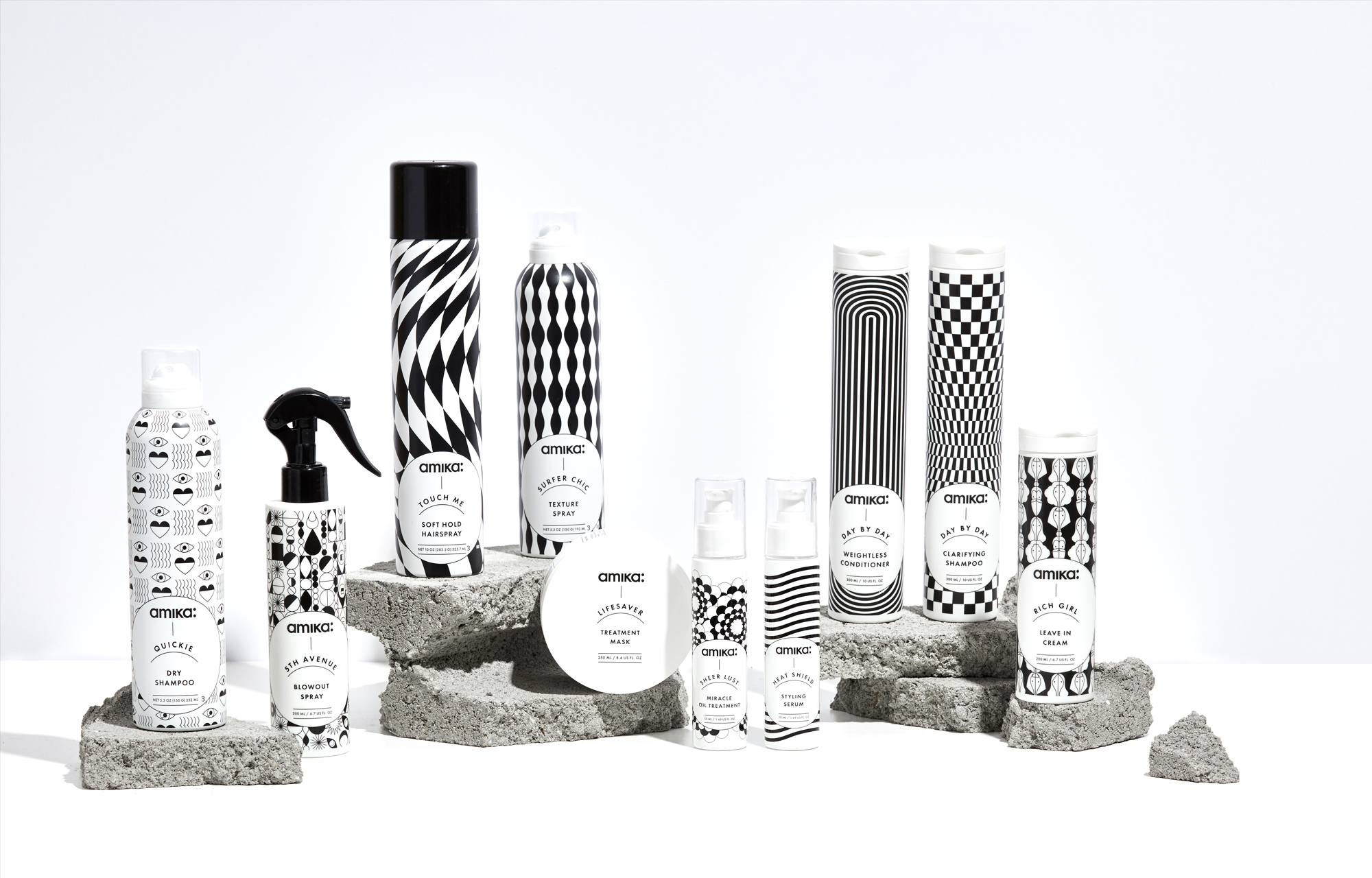
QUICKIE ─ 5TH AVENUE ─ TOUCH ME ─ SUPER CHIC ─LIFESAVER ─ SHEER LUST ─ HEAT SHIELD ─DAY BY DAY ─ RICH GIRL
THE TYPOGRAPHY
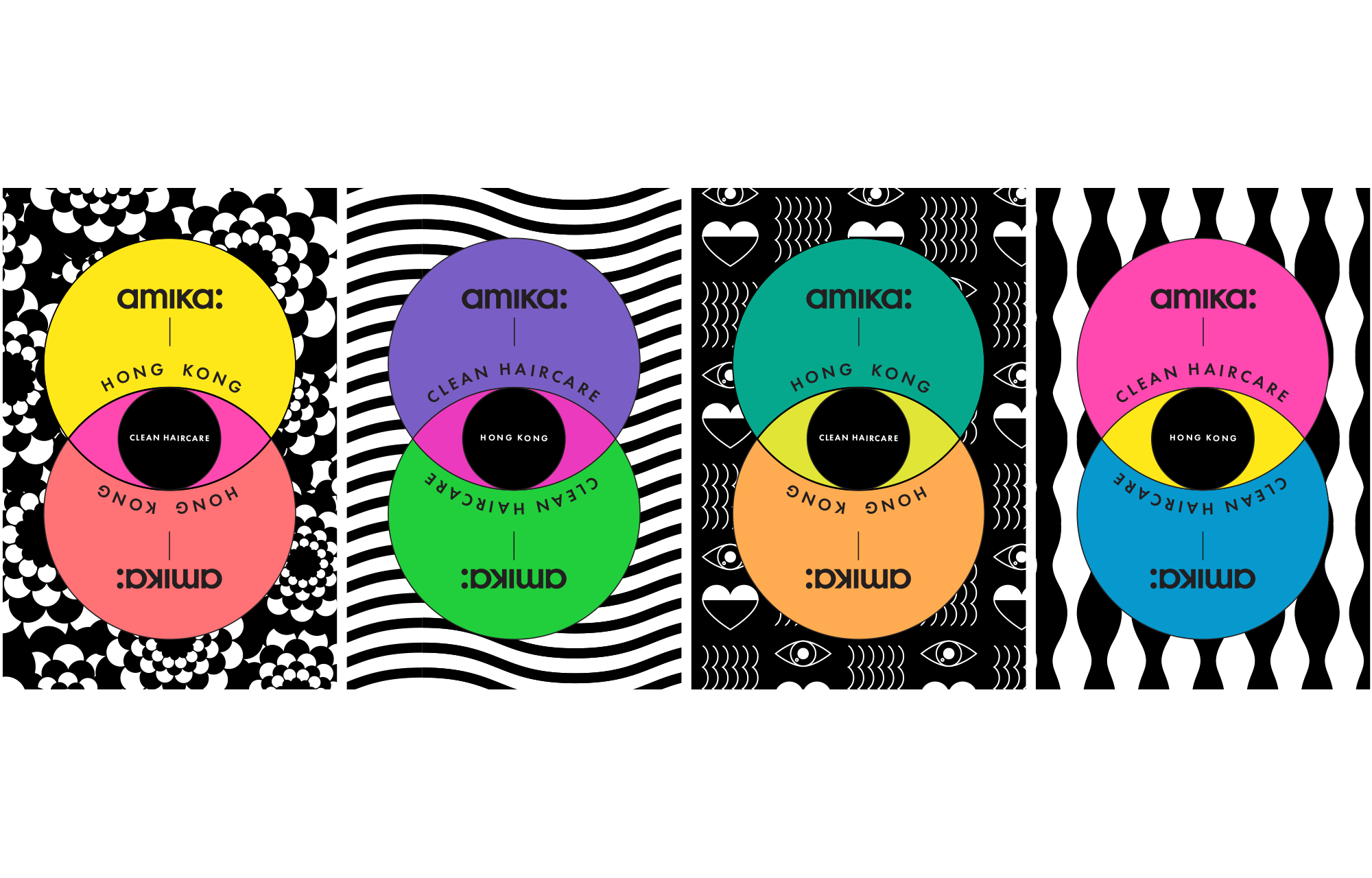
a typography system based around the circle creating a focal point and organized system for delivering infromation with play.
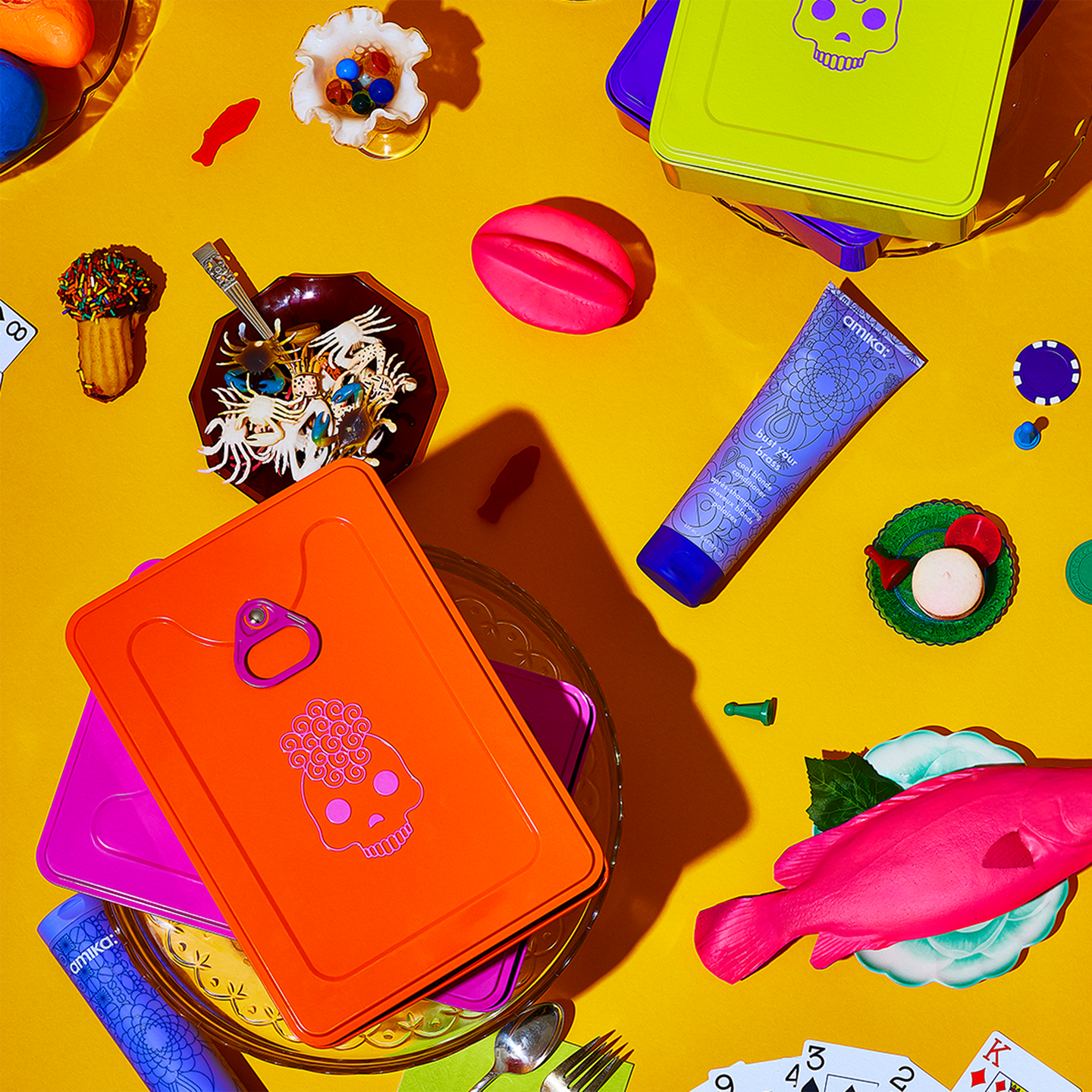
THE PATTERNS
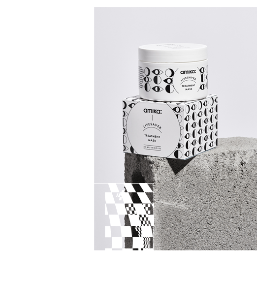
a library of patterns, a unique one for each product gives each item its own mini identity.

THE COLORS
while primarily black and white the line uses neon colors as little moments of surprise and emphasis throughout.
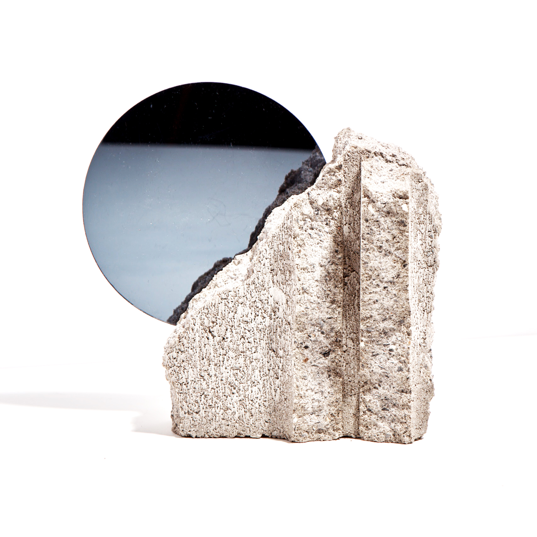

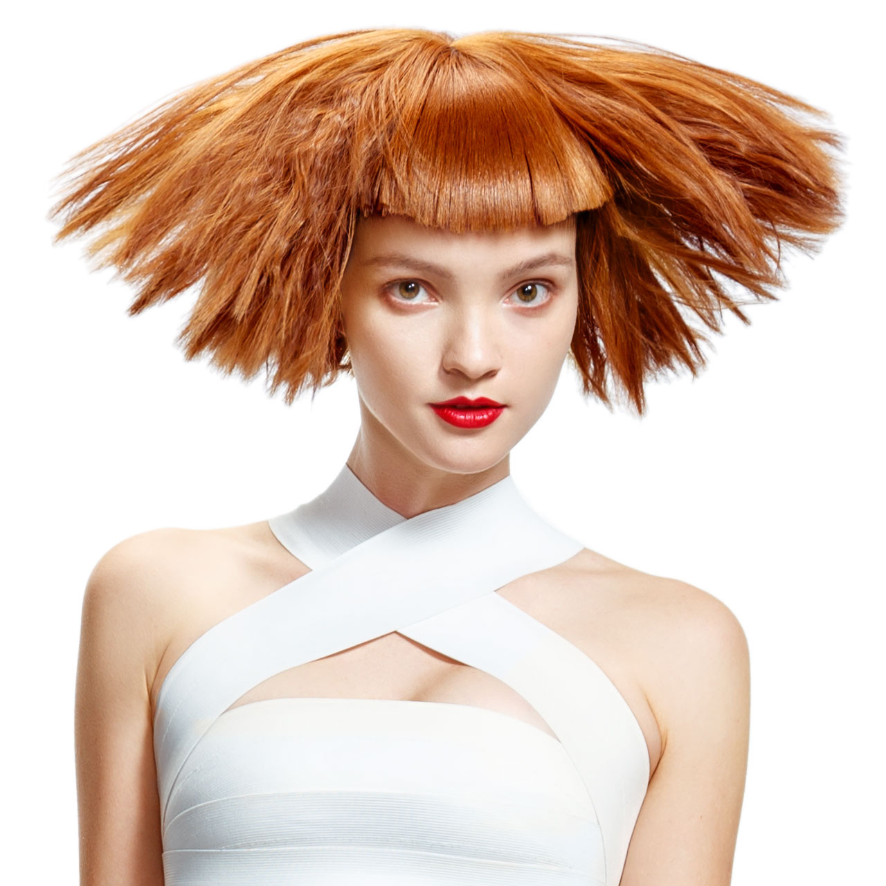
Anti-Gravity Photo Booth / OriginalProject type
Anti-Gravity Photo Booth PublishedProject type
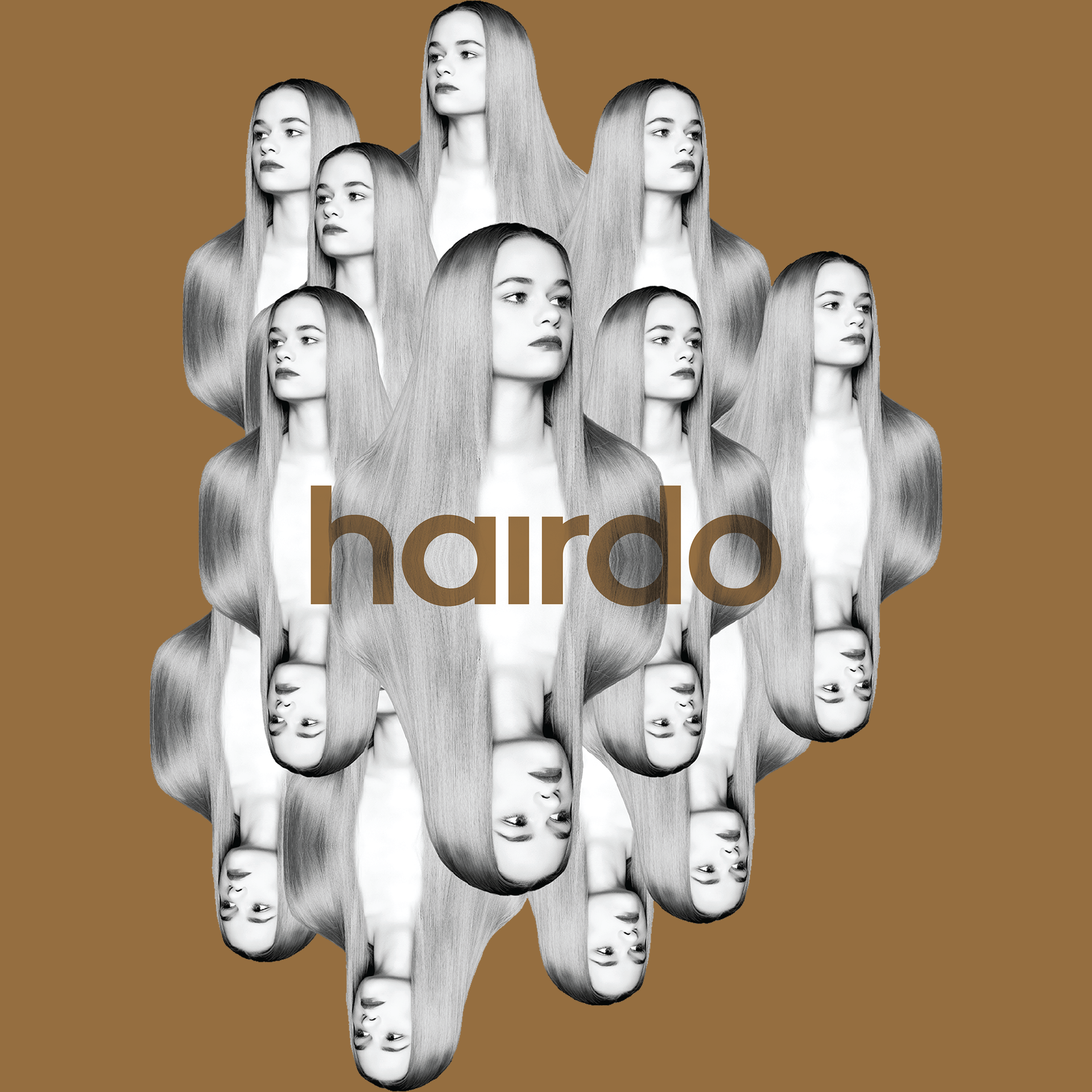
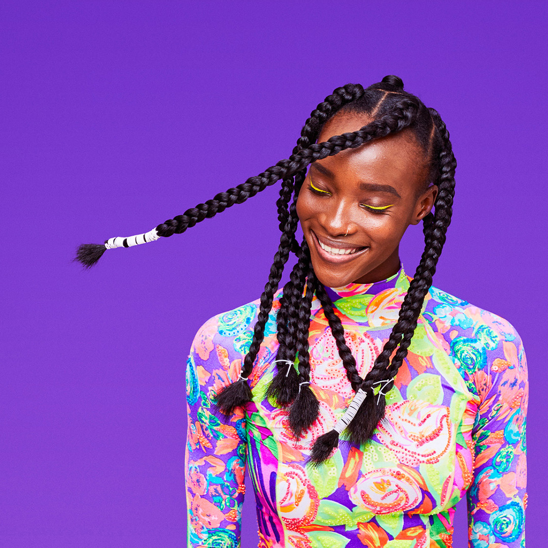
HairdoProject type
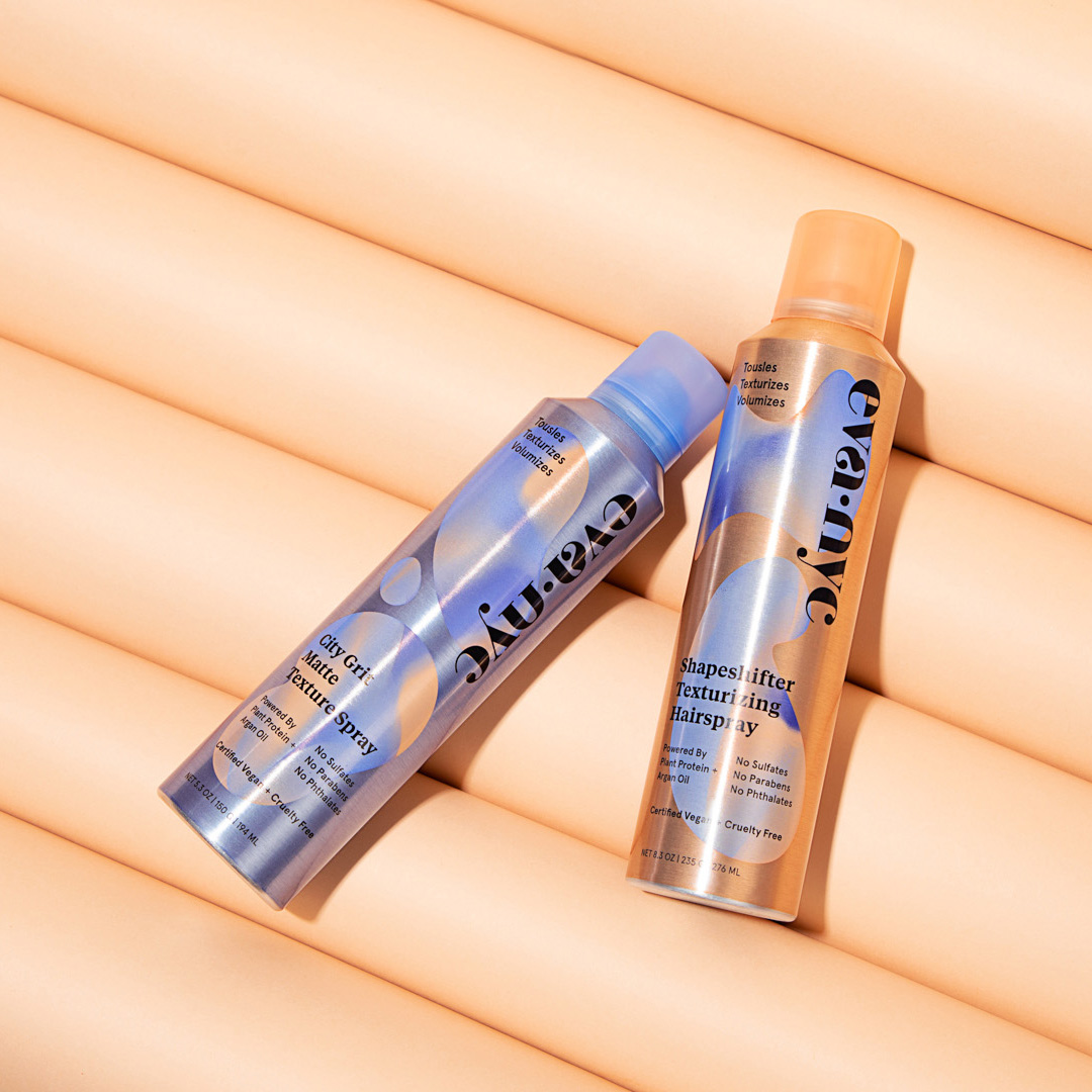
Eva NYCProject type
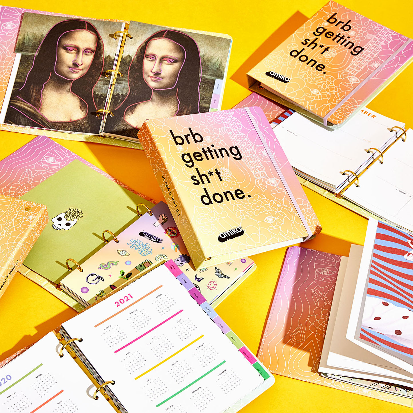
Amika 2020 PlannerProject type
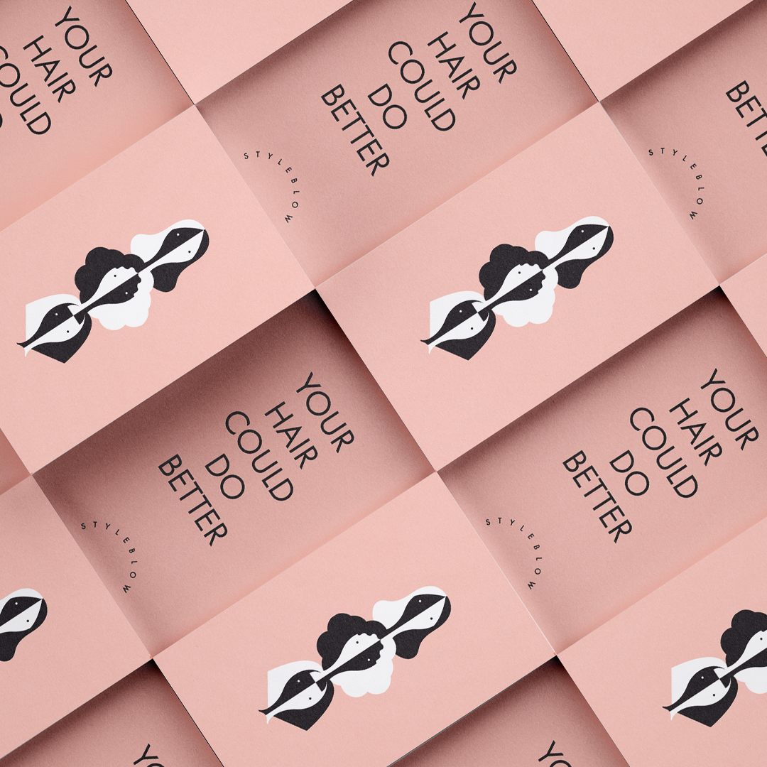
StyleblowProject type
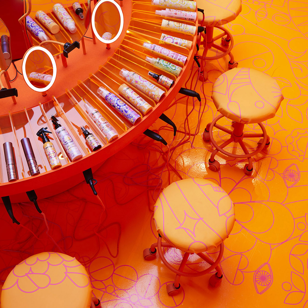
Amika Soho Pop-upProject type
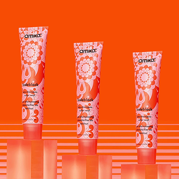
FadeblockPackaging Design

Amika VirginProject type
Amika Air CampaignProject type
Amika 2018 CampaignBeauty Campaign
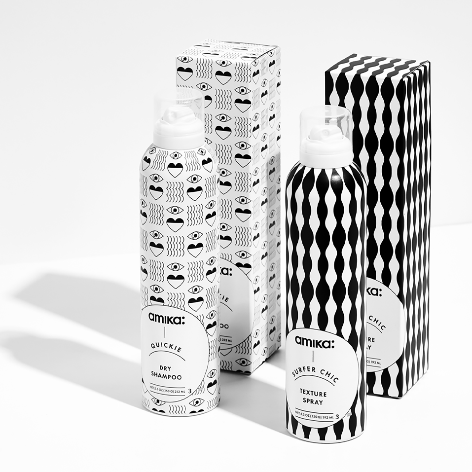
Amika Hong Kong EditionBRANDING, PACKAGING, NAMING< ART DIRECTION
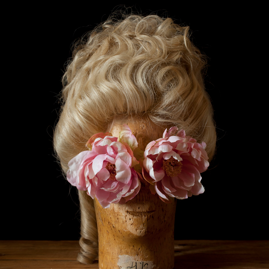
Wig ShootEditorial + Art Direction
Amika HolidayPackage Design + Art Direction
Vita Raykhman is a Creative Director
and Brand Strategist.