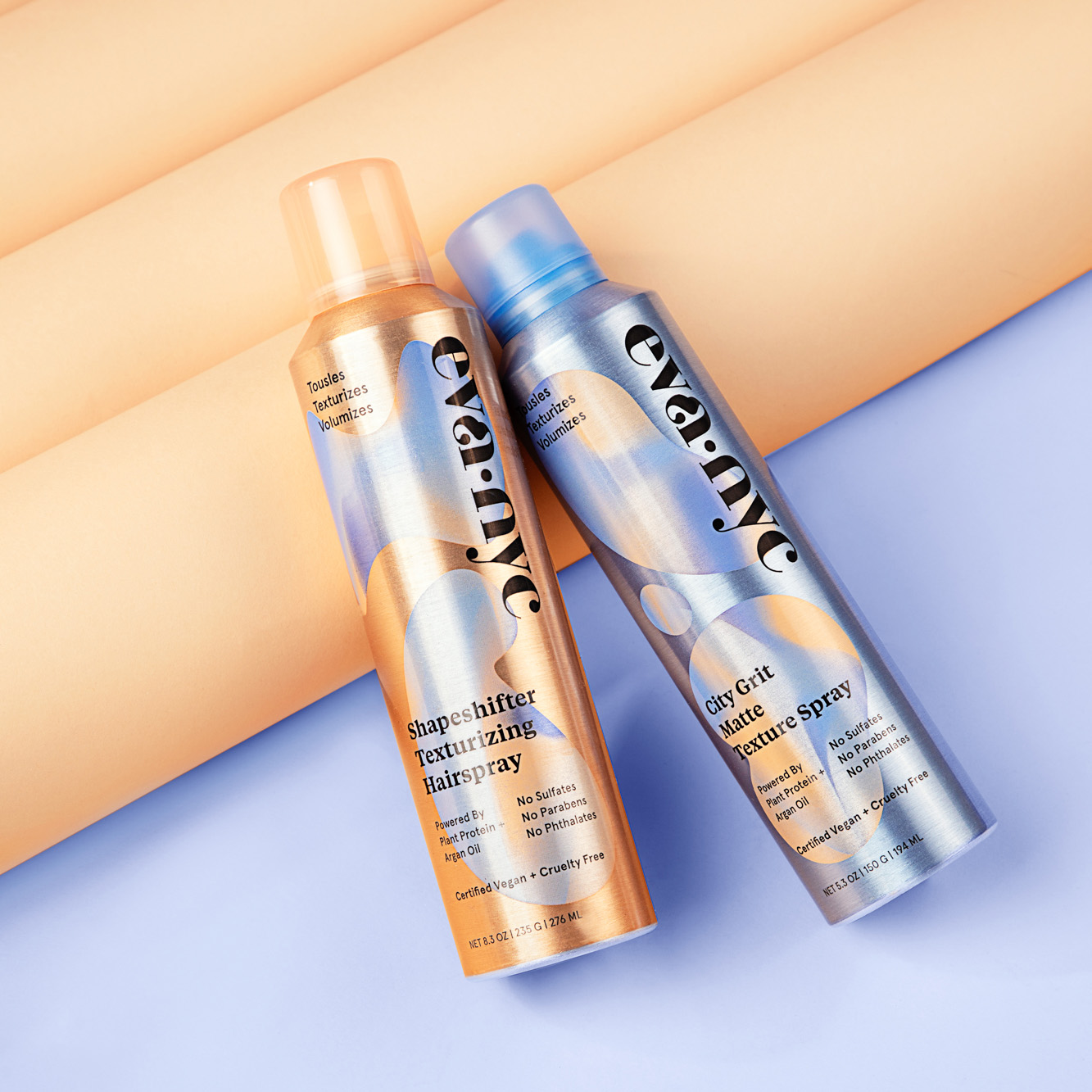
PACKAGING DESIGN, ART DIRECTION
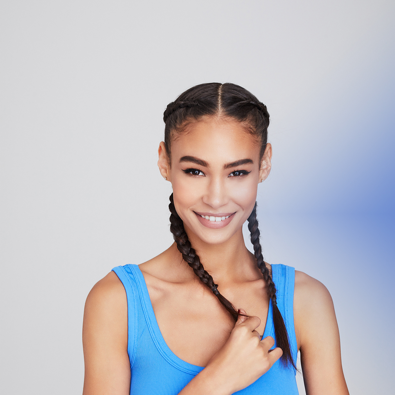
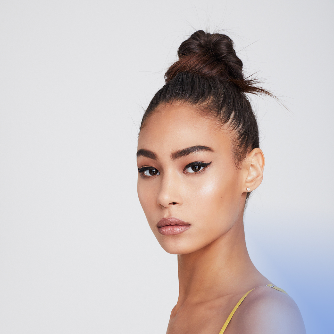
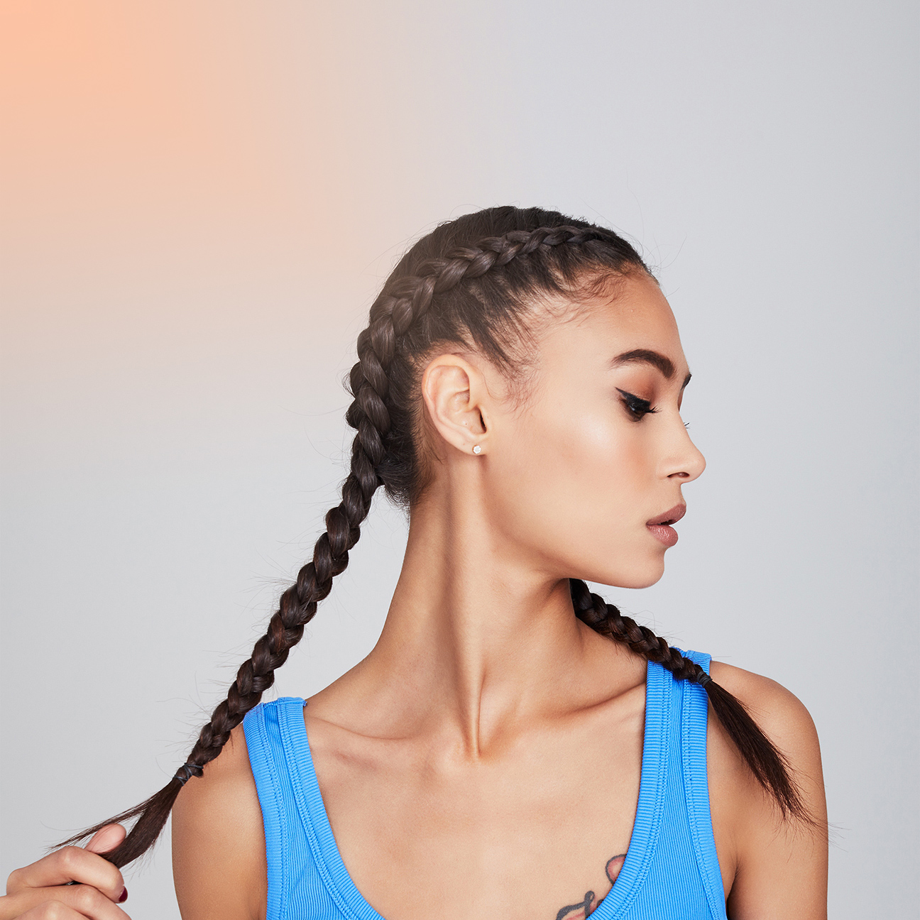
The Launch of the Texture Collection came at a transitional time for the Eva brand. The brand was moving towards a strategy and positioning pioneering Clean beauty and sustainability in the mass market hair space.
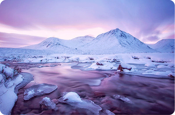
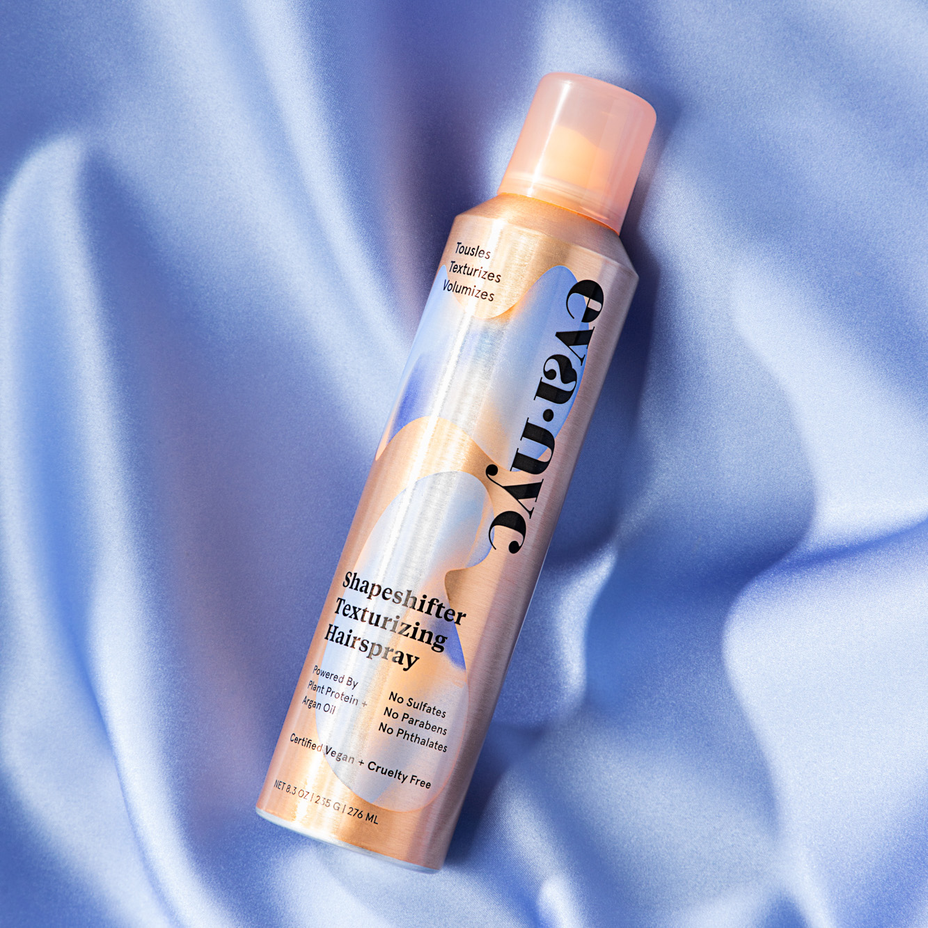
The gradient had always been a part of the brand and packaging system but now we looked to connect it to the natural world. We looked at landscapes and how color in nature is not fixed but rather often flows or merges from one into another.

THE GRAPHICS
We also looked at natural shapes like those made by water and liquids as well as single cell organisms. We started experimenting with putting the two together. We found that the gradients contained within organic shapes gave the graphics and packaging a sense of movement and life.

Pantone 7451C Pantone 162C Pantone 2130C
THE PACKAGING
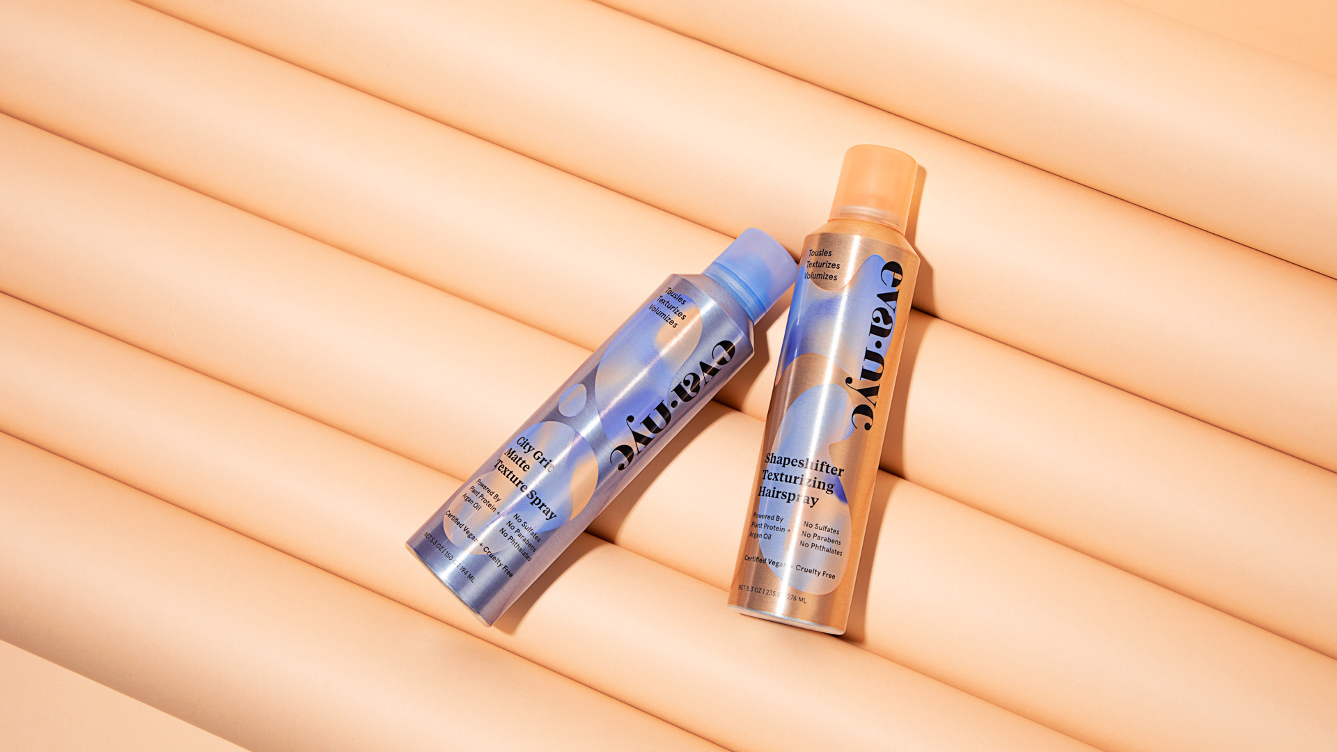
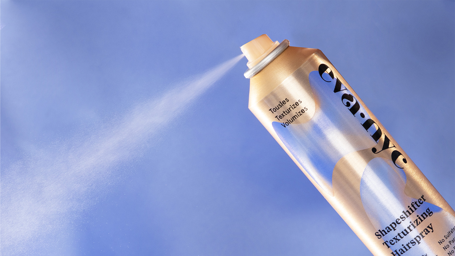
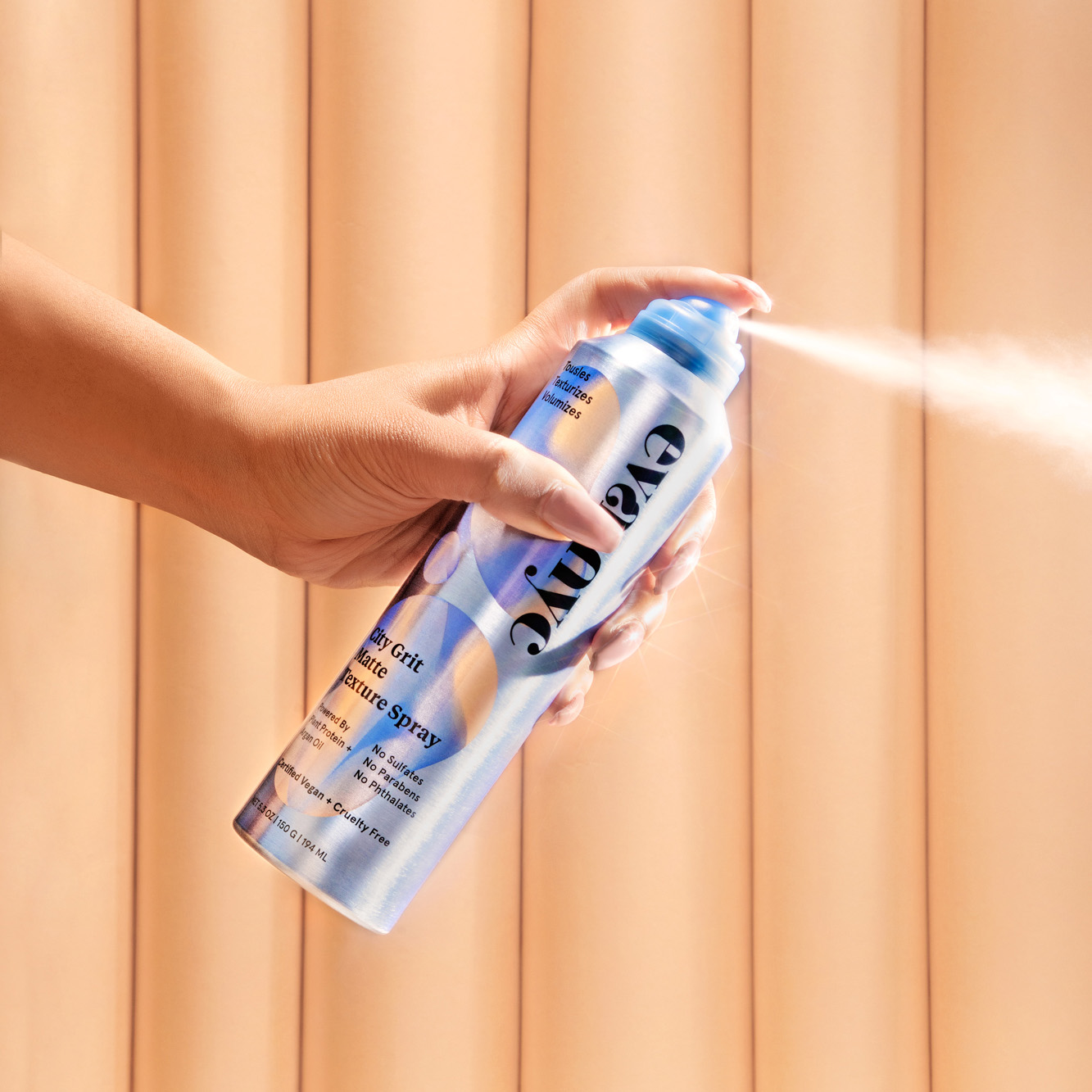
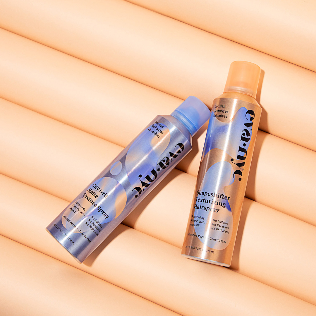
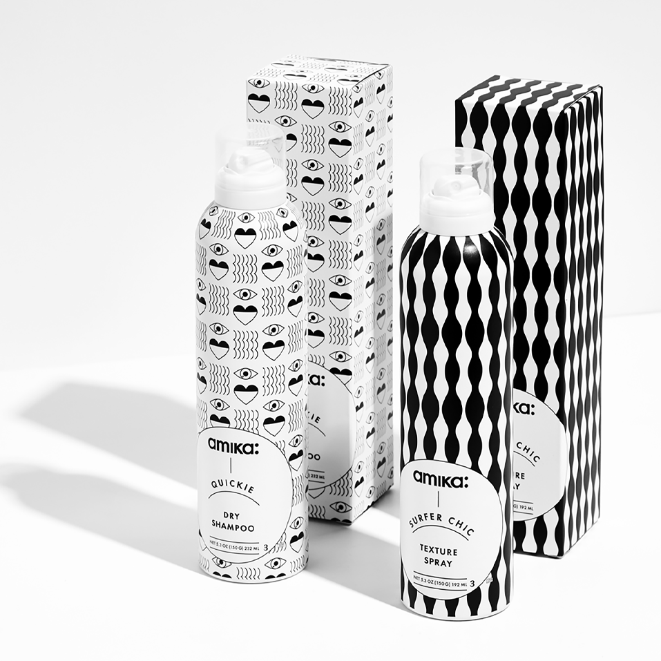
We introduced a new technique whereby we allowed the aluminum texture of the cans to show through (instead of covering them with white as is standard). This really connected to the collection being about texture. It also gave the packaging a raw untouched feeling that connected to the Clean Beauty direction that the brand was taking.

THINGS AREN'T ALWAYS SMOOTH
What’s interesting about being an in-house studio is projects don’t always have a 100% clear and straightforward trajectory. In this case, the texture collection was launching in the midst of the brand development and exploration process. Although this was our favorite concept and one of the favorite package designs we had ever done, when it came to the decision of whether or not to choose this to be the system across the line, consumer research showed that our audience preferred another direction.
And so this unique system stayed within the texture collection and did not migrate across the line.

Anti-Gravity Photo Booth / OriginalProject type
Anti-Gravity Photo Booth PublishedProject type
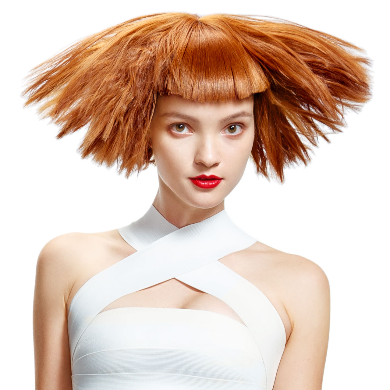
HairdoProject type
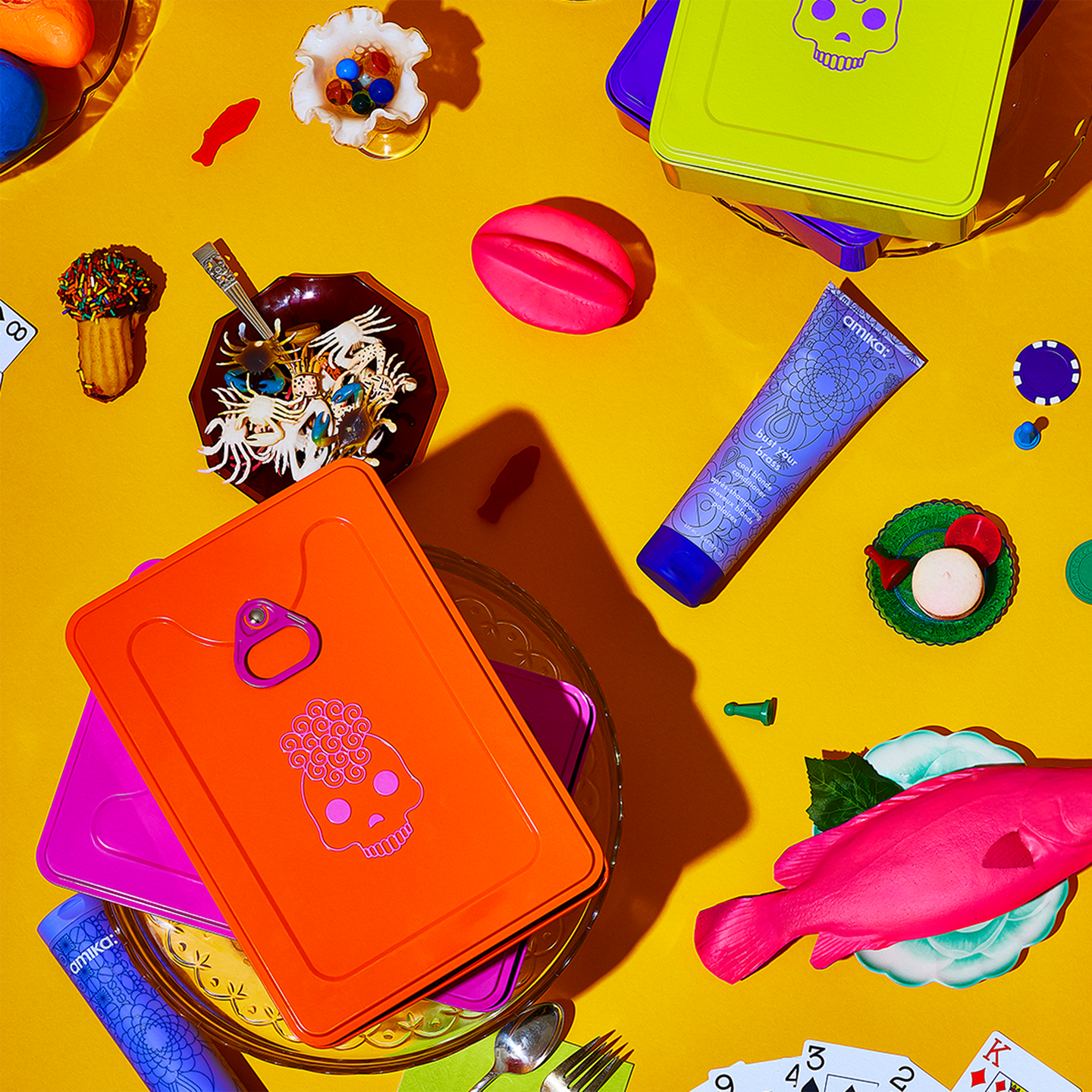
Eva NYCProject type
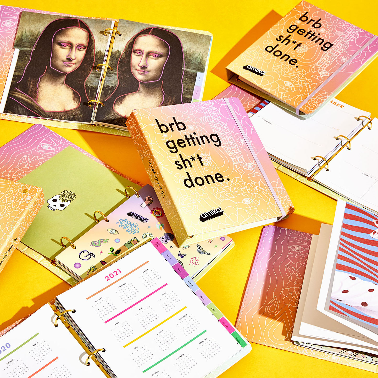
Amika 2020 PlannerProject type
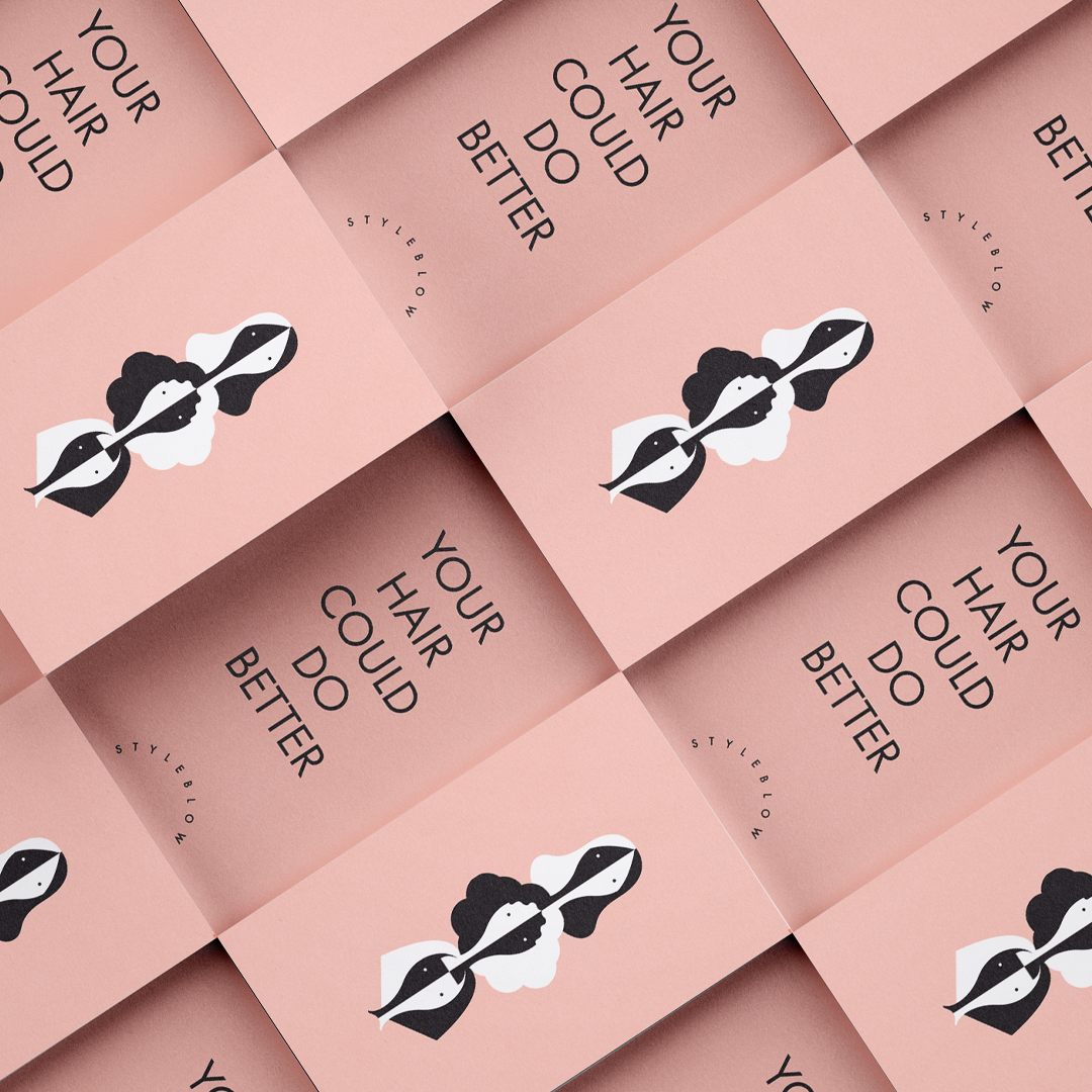
StyleblowProject type
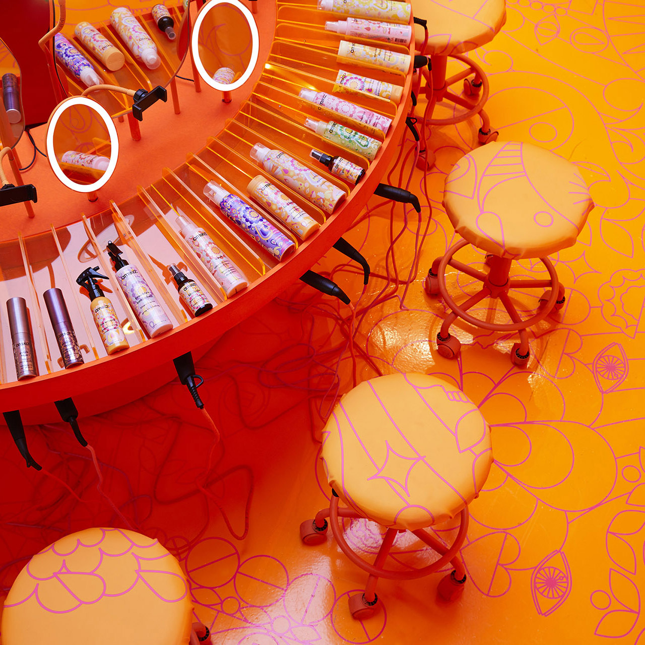
Amika Soho Pop-upProject type
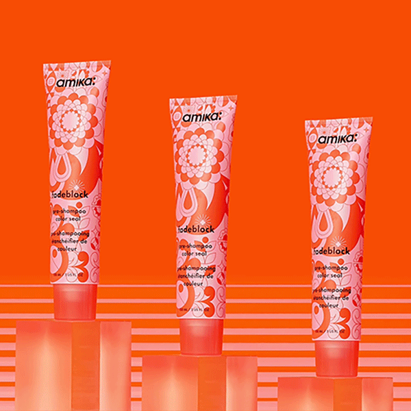
FadeblockPackaging Design

Amika VirginProject type
Amika Air CampaignProject type
Amika 2018 CampaignBeauty Campaign
Amika Hong Kong EditionBRANDING, PACKAGING, NAMING< ART DIRECTION
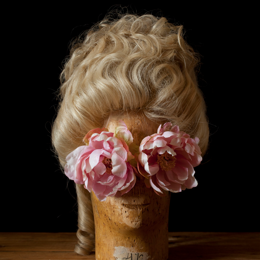
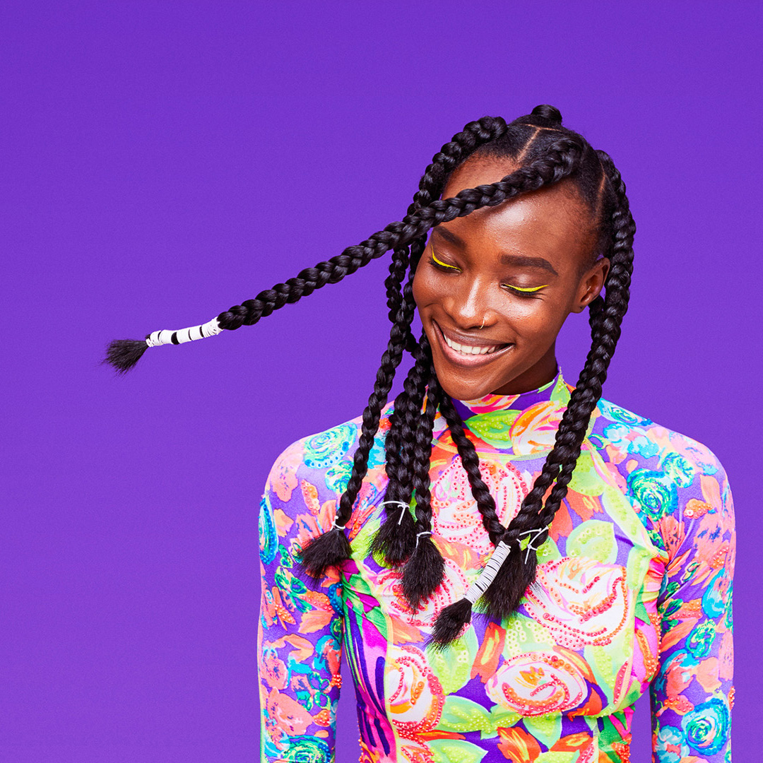
Wig ShootEditorial + Art Direction
Amika HolidayPackage Design + Art Direction
Vita Raykhman is a Creative Director
and Brand Strategist.